Colorado Christian University - New Visual Identity
The old word mark (below) was created in the early 90's and didn't portray the story of the university and was outdated. The old mark was relegated to use as a sign-off and the mailing panels of direct mail pieces.

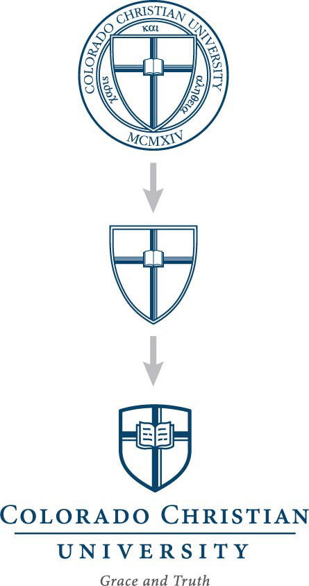
The new visual identity was then based off of the university's official seal, which tells a story. The Bible, the cross centered in the shield of faith, all surrounded by the name of the university and the year 1914, the founding year. Finishing off the seal is the motto of the university in the greek words for grace and truth.
The idea was to pull the shield, cross, and Bible and create a modern, iconic mark that embodied the story of the university. Then myself and another designer embarked on finding the right shape for the shield, Bible, font, line weight and spacing of each element. Below is what resulted.

Below are the different logos for the respective schools within the university.